
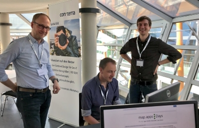
 At this year's map.apps days, con terras UX-AG conducted a user study with the visitors. On the one hand, an instrument of the user-centered method collection was demonstrated, and on the other hand, data for a bachelor thesis in psychology was collected. For this purpose, two desktop workstations were set up in the Factory-Hotel café, with practical tasks that were to be solved using the map.apps Results Center.
The question was asked, how many cognitive resources have to be used when using map.apps, and compared whether these resources can be reduced by a clearer visualization of the relationship between map and result center. The tested prototype was able to keep up with the current version of map.apps and showed interesting trends in the results. A total of 60 users from the map.apps environment took part during the two days of the event.
Which problem was investigated?
Put simply, the mapping of the result center's entries to the corresponding positions on the map. In the context of tasks that involve both the textual and spatial information of an object, the visualization of this context may make the difference in the user experience, providing a way to save cognitive resources.
The two most common techniques are so-called highlighting (when hovering over an entry, the corresponding object in the map lights up in a different/brighter color) and zoom-to (when clicking on an entry, the view is centered on the corresponding object in the map). For highlighting, it is absolutely necessary that the searched map entry is located in the currently visible map section. If this is not the case, an extensive panning of the map or a zoom out is absolutely necessary in order to view the searched entry. This additional effort could lead to an increased mental strain. We do not have this problem with zoom-to, but this function brings with it an uncontrolled, automated movement of the map. Depending on the relative position of the entries to each other, the jump at this point can be very large. So it is very likely that the user loses their spatial orientation.
Which solution is in the prototype?
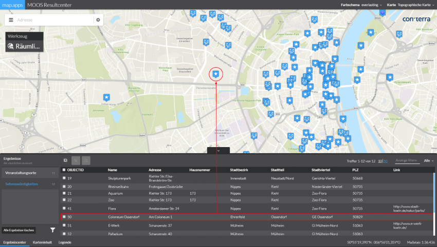
In order to be able to solve the before mentioned problems with highlighting and zoom-to, an optimized visualization for the connection between result center and map was developed in several steps. The so-called wedges (see Figure 1), a visualization of objects outside the visible map section on mobile devices [1], serve as the basis. Due to the ability of the human brain to recognise shapes (in this case triangles) [2], the user is continuously aware of the position of all map entries and is able to navigate specifically to the desired entry. This visualization was supplemented by an alphabetical coding (see Figure 2) in order to be able to permanently assign the individual entries. If the map is now stretched or zoomed, the triangles continuously adapt to the new display (see Figure 3). This new visualization was tested in this user study against a comparable standard configuration of map.apps, which had no wedges or alphabetical coding.
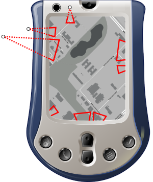
Figure 1: The so-called wedges were developed to save the user of mobile map applications on older PDAs from having to search aimlessly for points outside the visible map section. By completing the indicated triangle (here represented by the dotted lines), it is possible to know all positions of the map entries continuously (according to Gustafson 2008).
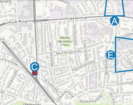
Figure 2: The implementation of the visualization in the prototype is based on the wedges (see Figure 1) and was supplemented by an alphabetical coding. This coding can be found in the Results Center and allows an easy assignment to the corresponding entry.
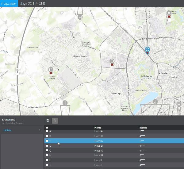
Figure 3: Functioning of the new visualization for permanent display of map entries.
Later, our colleagues from Esri UK followed a similar approach called „directly“. This approach was developed during a JavaScript challenge at the beginning of October. A short video on Twitter outlines the interaction design. This design, however, does not include means to visualize correlations between data on the map and additional textual pieces of information. Additionally, „directly“ has apparently not been evaluated scientifically yet, so there are no insights about its user experience nor usability. The Github project page, however, lists a number of intriguing aspects, that could be evaluated in subsequent work.
What was measured, and how?
The tasks were selected in such a way that information from the Results Centre had to be checked for each of the existing entries (the number of stars in a hotel or the size of an area) and, in addition, the environment or the form of the corresponding entry had to be evaluated. The participants were therefore forced to make an assignment between the results centre and the map. Since the optimization of the mapping aims not only at faster or better processing of a task, but primarily at relieving the user, three subjective questionnaires were selected from the UX toolbox. With the help of these tools, various factors of the user experience can be illuminated - and then the measured differences can be interpreted.
First, the NASA-TLX (Task Load Index) was used to query the perceived mental workload, the perceived effort and the perceived frustration when working on the tasks [3]. The results showed a slightly increased mental workload, which is probably due to the new and unknown element in the participants with application knowledge. This was confirmed by feedback such as "After a little training it seems very easy" and "The new form took some getting used to at first, but was of course also practical afterwards". The perceived effort and frustration among the users of the prototype could be marginal reduced (see Figure 4).
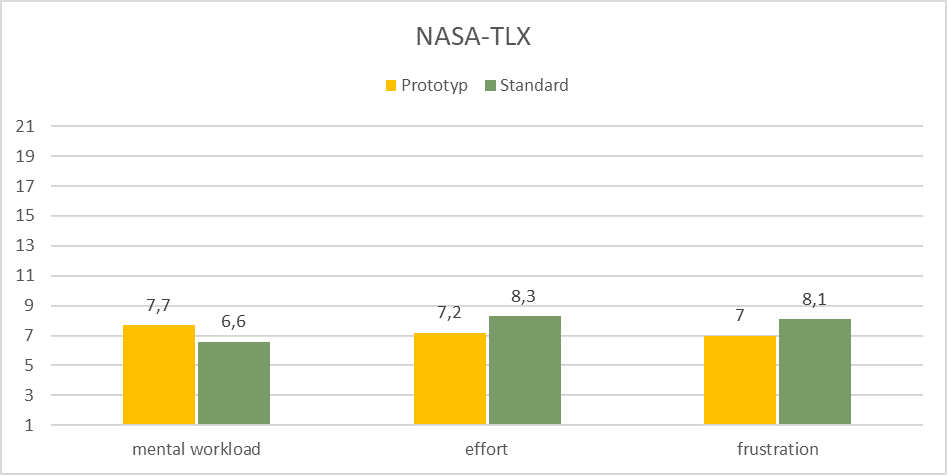 Figure 4: With the NASA-TLX, the participants rate the subjectively perceived mental workload, effort and frustration after each task on a scale of 1-21. This diagram shows the mean value of all participants. The new visualization seems unfamiliar at first, but then reduces the effort and frustration when working on the special tasks.
The UEQ-S (User Experience Questionnaire - Short) was used as a further tool to record the perceived pragmatic and hedonic quality [4]. The pragmatic quality is also to be understood as "practical" quality: how practical is the application and how efficiently is the user supported in solving the task? The hedonic quality describes how stimulating or appealing the application is and whether the user identifies with the image or design. For the prototype, an slight improvement of both qualities could be recorded in a direct comparison (see Figure 5). The optimized visualization does not only seem practical as well, but also appeals to the participants in the hedonic quality described above. Participants commented on this as follows: "Is very clear and easy to use" and "Clear layout - functional, simple".
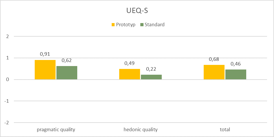 Figure 5: The UEQ-S divides the perceived user experience into pragmatic and hedonic quality. Both qualities then form the total value. The values are shown on a scale from -2 to 2 and show a slight improvement for the prototype.
The results of the UEQ-S on the perceived user experience were confirmed by the UMUX-Lite (Usability Metric for User Experience - Lite) [5], which was also used. The trend in favour of the prototype can also be seen here (see Figure 6). Although the UMUX-Lite consists of only two questions, it allows an assessment of usability due to its strong correlation to the established Usability Score (SUS) system.
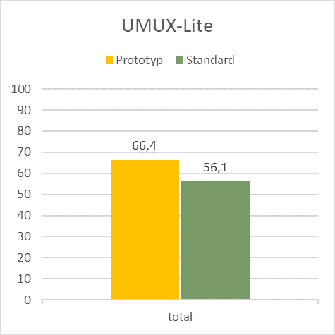
Figure 6: The UMUX-Lite publishes a total value from 0 to 100 and describes the usability share of the user experience. In this special task, the prototype was rated marginal more usable by the participants.
Furthermore, it was measured how much time was needed for the tasks and what zoom, pan and click actions the participants performed. These results are currently being evaluated and visualized by René Unrau for his doctoral thesis. A further article is to be expected here in the near future.
Conclusion
The user study conducted by con terra in the Spatial UX performance area was able to generate important results and feedback on the relationship between results center and map. Some findings on the optimisation of the highlighting have already been implemented in the current version, map.apps 4.5.0. Before a possible implementation of the experimental prototype, further optimizations and tests are necessary. In addition, the study was an interesting agenda item for the visitors.
Apart from these results, the UX-Team was able to further optimize its method collection and strengthen its team competence for the future with psychologist Lukas Blickensdorf and through cooperation with the Institute for Organizational and Business Psychology (OWMS).
Take your first UX step!
Has this article aroused your interest in the Spatial UX range of services from con terra? Further information and customer opinions can be found at ux.conterra.de. We would also be happy to send you our white paper without obligation or advise you on our UX offers.
Are you looking for an internship or a thesis in the field of Usability, User Experience or User-Centered Design? Then send your application by e-mail to m.ostkamp@conterra.de.
Literatur
[1] Gustafson, S., Baudisch, P., Gutwin, C., Irani, P., 2008. Wedge: clutter-free visualization of off-screen locations. ACM Press, p. 787. https://doi.org/10.1145/1357054.1357179
[2] Wertheimer, M., 1923. Untersuchungen zur Lehre von der Gestalt. II. Psychologische Forschung 4, 301–350. https://doi.org/10.1007/BF00410640
[3] Hart, S.G., Staveland, L.E., 1988. Development of NASA-TLX (Task Load Index): Results of Empirical and Theoretical Research, in: Advances in Psychology. Elsevier, pp. 139–183. https://doi.org/10.1016/S0166-4115(08)62386-9
[4] Schrepp, M., Hinderks, A., Thomaschewski, J., 2017. Design and Evaluation of a Short Version of the User Experience Questionnaire (UEQ-S). International Journal of Interactive Multimedia and Artificial Intelligence 4, 103. https://doi.org/10.9781/ijimai.2017.09.001
[5] Lewis, J.R., Utesch, B.S., Maher, D.E., 2013. UMUX-LITE: when there’s no time for the SUS. ACM Press, p. 2099. https://doi.org/10.1145/2470654.2481287