service.monitor 4.3 is now available for download and offers many innovations, especially in the area of analytics. Special attention was paid to the further development of the analysis dashboards.
Dashboard printing
The analyses created on the dashboards can now be easily printed out and stored for the long term. The print preview can be optimized via the filters as long as necessary before the dashboard is printed out via the browser. Once the analysis results have been obtained, they are retained and support information-driven decision-making processes in your application context. The data analyst can therefore share the information with other actors and user groups and integrate it into reports, for example. Operation, management or development benefit from the value of information without having to have direct access to the system.
Support for map.apps 4
service.monitor Analytics is characterised by a strong integration with map. apps and since the last version, major developments have taken place in map.apps. This version provides strong support for capturing events in new map.apps 4 applications on the new Esri Javascript API. A new feature is the ability to recognize whether users are viewing the maps in 3D or 2D mode.
Visual access to recorded user interactions: EventStreams
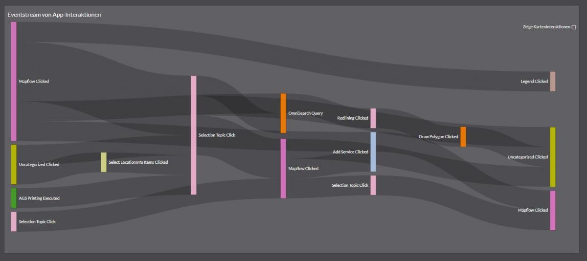
EventStreams are a completely new way of finding visual access to recorded user interactions. Each user can use map.apps to string together a number of events. The EventStream aggregates multiple client sessions according to their sequence of events and displays them in a weighted flowchart from left to right. This provides the data analyst with easy access to a large amount of data. The event streams can be used to better assess how purposefully users pass through a workflow offered by an application or whether there are exit points that indicate a premature end of user interaction. The acceptance and use of different interaction possibilities in complex tools or widgets is also a possible field of application for EventStreams.

EventStreams can easily be used for a focused question in the application landscape, especially if the pattern "One application for one application case" is followed. EventStreams are initially implemented as an experimental feature in the product. We want to know your opinion about the EventStreams! What is good, what can be improved? Please use the feedback form available in the dashboards or contact us.
New widgets: Aggregate data by time
The new chart type "Histogram" visualizes the time history of data values of a query. The data analyst obtains information from changes in these parameters over time. For example, he or she can understand how the number of times an app is called per week has changed since the app was published and advertised. By selecting the aggregation period of the data (year, month, week, day, hour or minute), a suitable reference frame for the data is always available.

The figure above shows the number of recorded events over a period of two years, aggregated on a monthly reference grid. As with all diagrams, the visualization can be dynamically modified using the dashboard filters.
Monitoring: Define server response expectations
The new "Expectations" can be used to further customize service monitoring. These expectations are conditions that service.monitor evaluates against the response of the monitored service. Currently, the user can check the occurrence of a text or the frequency of the occurrence of a text. Experienced users can check the response with regular expressions. If the expectation is not fulfilled, service.monitor reports via the defined notification channels.
Monitoring as teamwork: Microsoft Team Notifications
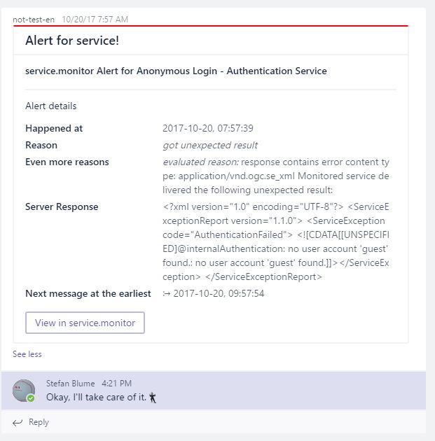
We believe that monitoring is teamwork and that information about service errors is relevant to a wider audience than the application users themselves. Since service.monitor already supports the collaboration tool Slack.com, messages can now also be sent to the group chat software Microsoft Teams.

All changes are fully recorded in the Release Notes.
